New Features
New All Active Flocks Dashboard
We have replaced the Growout > All Active Flocks dashboard in Sonar Web Analytics with a new and improved version. This new dashboard is built using Power BI, allowing users to slice and dice the data to provide the insights needed.
The filters along the top allow you to view specific sets of farms. The Avg Weight and Water Feed Ratio by Age Group charts summarize these values for all active flocks by their age in weeks (ex. Week 2 is ages 8-14). This empowers users to identify the growth patterns for all of their active flocks and quickly spot outliers. The map allows you to visualize your farms alongside current weather and colored by the benchmarking score by company.
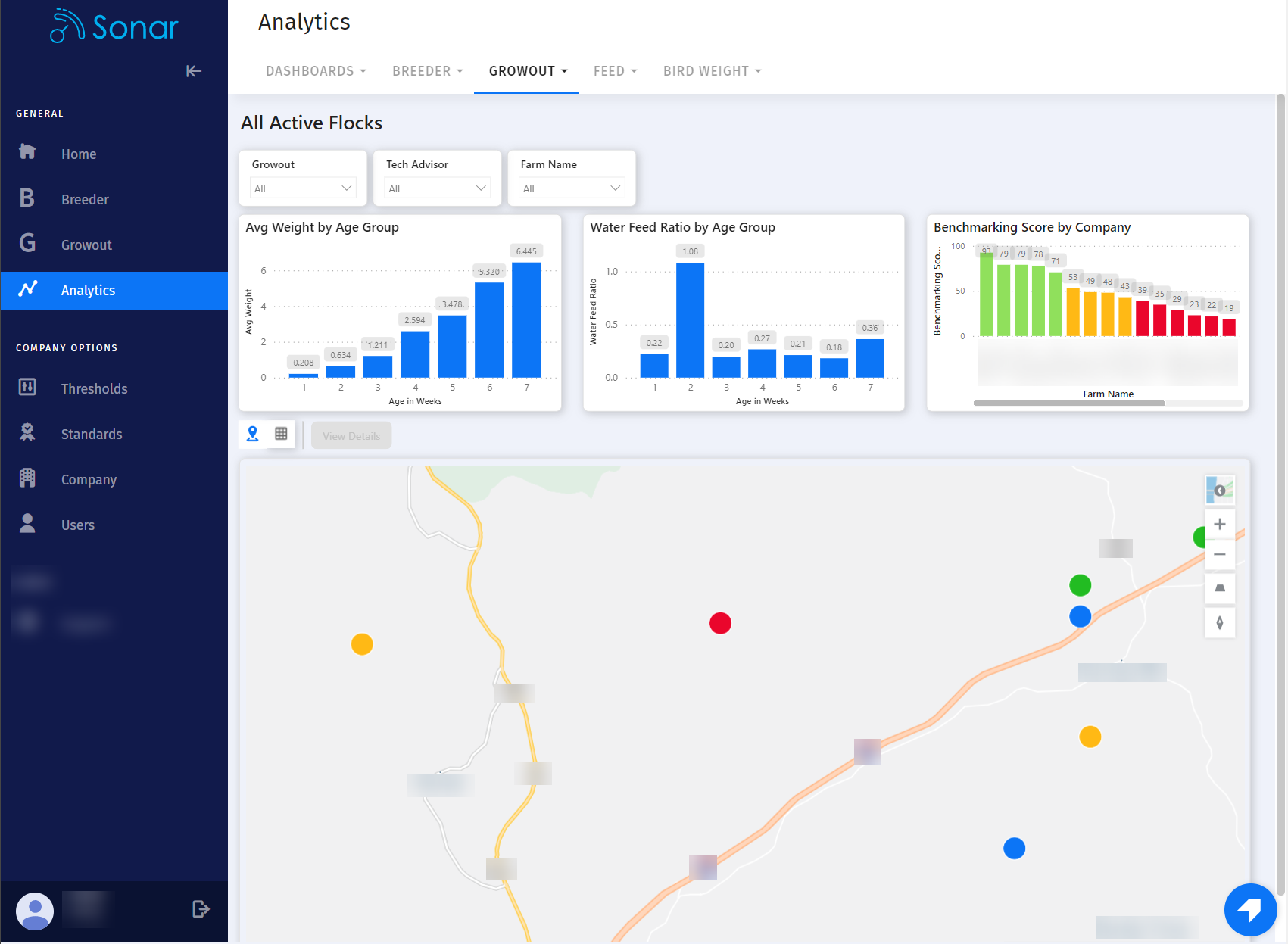
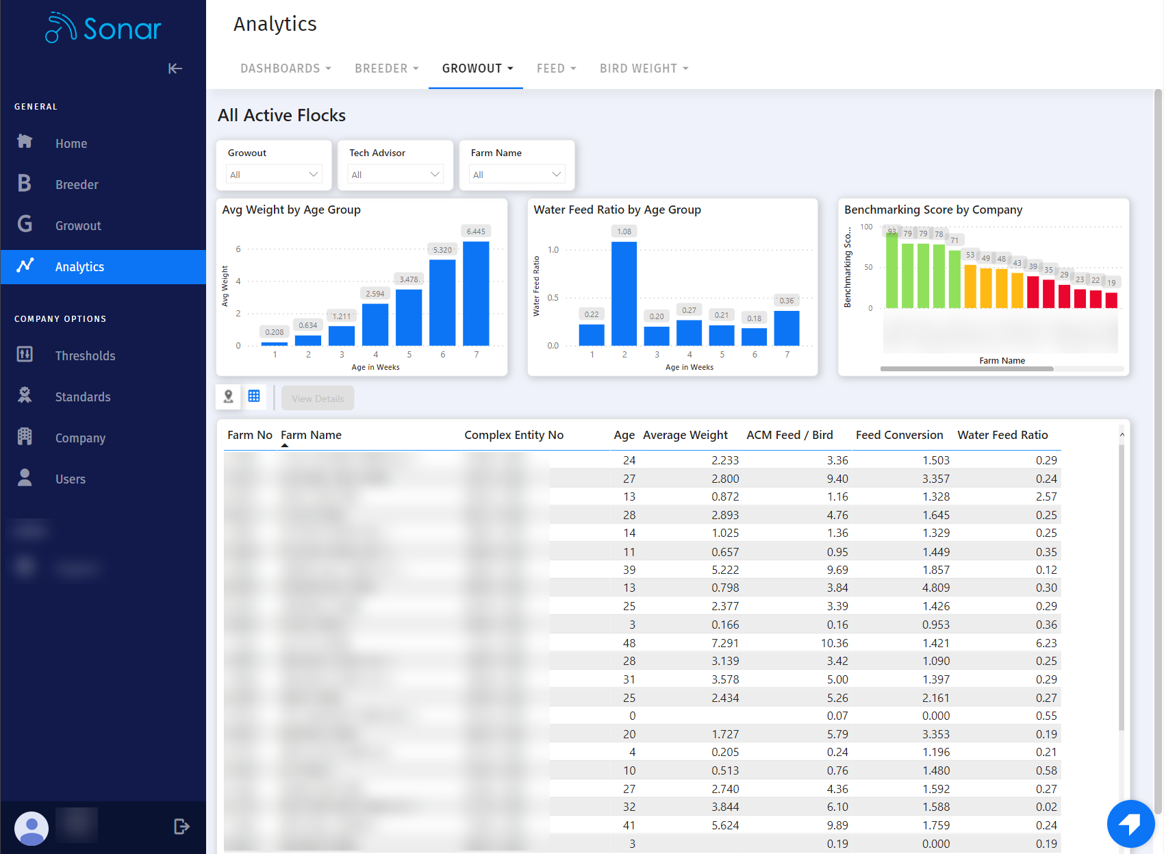
Users can toggle between the map and grid view. The grid view provides a quick summary of the main KPIs for all active flocks.
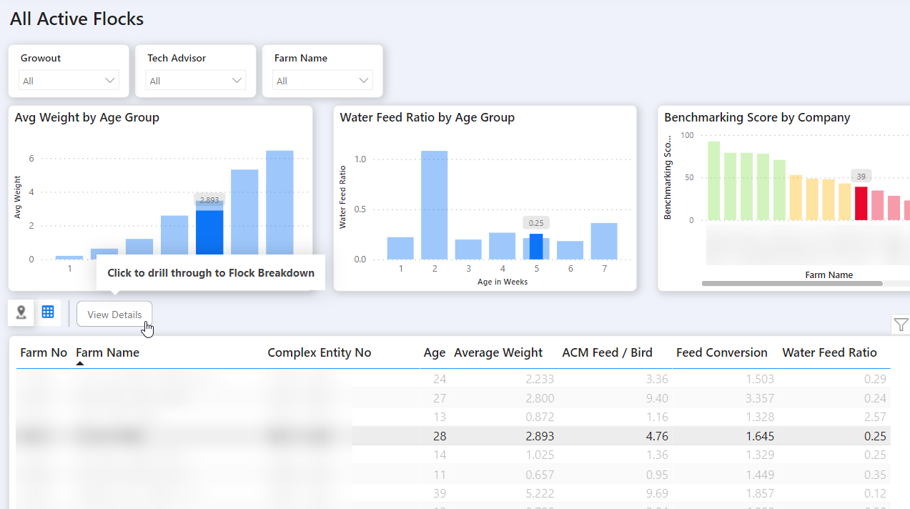
Users can also select a farm > View Details to drill into the Flock Breakdown dashboard.
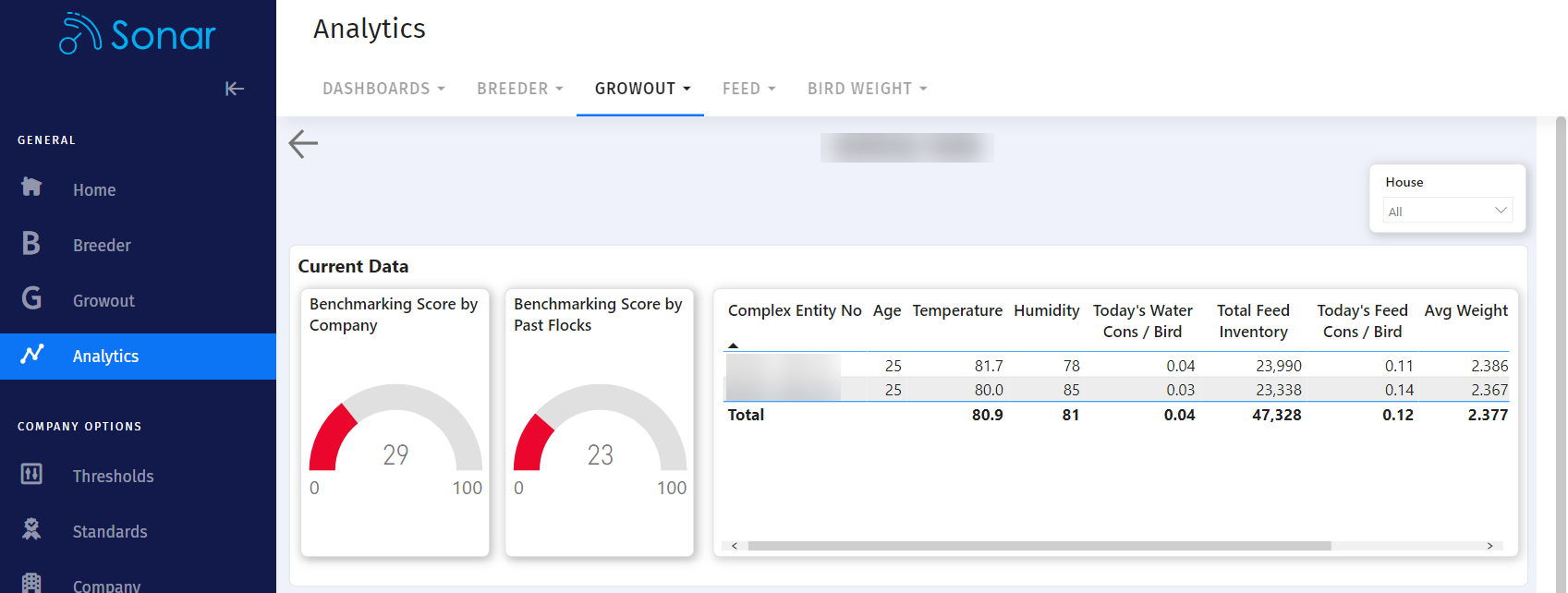
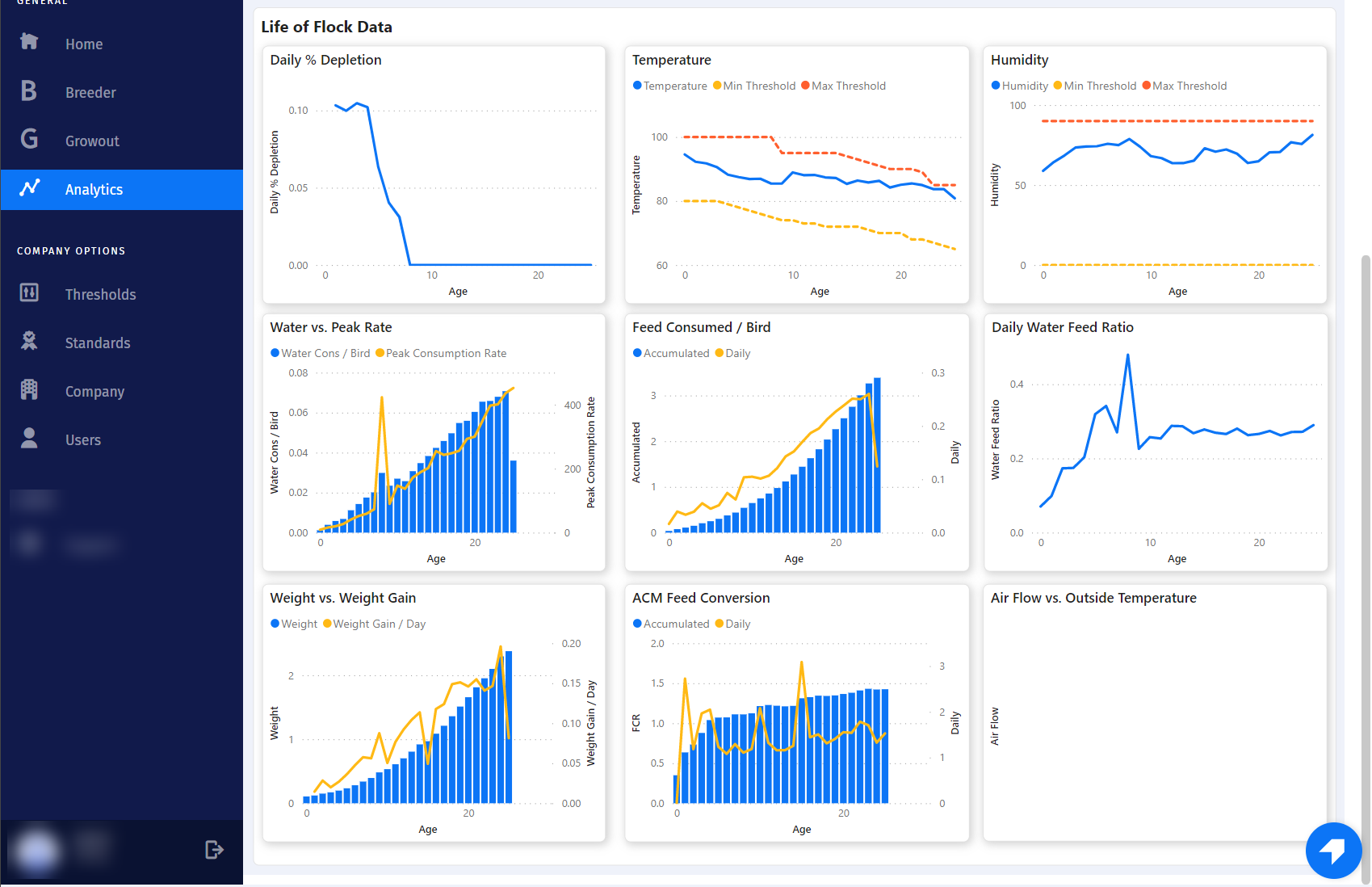
The Flock Breakdown dashboard provides all of the charts for a single flock summarized. Users can also find the house filter in the top right corner to drill into data for a single house.
Note: Over the coming weeks, the Dashboards > Map dashboard will be deprecated as it is merged with this new version of the All Active Flocks dashboard.
Bug Fixes
- Improved performance throughout the app.
- Updated the Feed Overview grid in Sonar Web to allow users to sort on all levels.
- Resolved an issue where the rank shown in the benchmarking screens was incorrect.
- Fixed a bug where some users could not open the mortality screen for a second time.
- Resolved a bug where the sensor details loading message would show at incorrect times.
- Updated the age calculation to fix an issue where some flock ages were not abiding by the age days adjustment setting.
